The Mapper Algorithm
A topological lens for high-dimensional data — building interpretable graphs from point clouds via the Nerve Theorem
Overview & Motivation
Persistent Homology gives us algebraic summaries of data topology — barcodes and persistence diagrams that count features like connected components, loops, and voids across all scales. These are powerful invariants, but they are abstract: a barcode tells you that a loop exists, not where it is or how it connects to the rest of the data.
The Mapper algorithm (Singh, Memoli & Carlsson, 2007) fills this gap. It produces a graph — a visual, interpretable summary of high-dimensional data that captures topological features like loops, branches, flares, and clusters. Each node in the Mapper graph represents a cluster of data points, and edges connect clusters that share points. The resulting graph is low-dimensional enough to visualize and explore, yet rich enough to reveal the global shape of the data.
To appreciate why Mapper matters, compare it with two standard approaches to understanding high-dimensional data:
- PCA / t-SNE / UMAP reduce dimensionality but can destroy topology. A circle projected to a line loses its loop; t-SNE can create spurious clusters. These methods optimize for local or variance-based criteria, not topological faithfulness.
- Persistent Homology preserves topology but produces abstract algebraic summaries. A persistence diagram says (two loops), but does not tell you which data points form each loop or how the loops relate spatially.
Mapper gives us the best of both worlds: a geometrically faithful, visually interpretable summary. The landmark paper by Lum et al. (2013) demonstrated this on breast cancer gene expression data (revealing a previously unknown subgroup of patients with 100% survival), NBA player statistics (recovering positional archetypes), and U.S. political voting patterns (visualizing polarization as a topological feature).
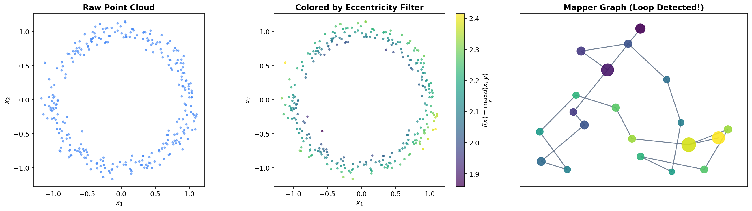
The key theoretical guarantee comes from the Nerve Theorem, which we proved on the Cech Complexes page. Under appropriate conditions, the Mapper graph has the same homotopy type as the underlying data — its connected components, loops, and higher-dimensional features faithfully reflect those of the original point cloud.
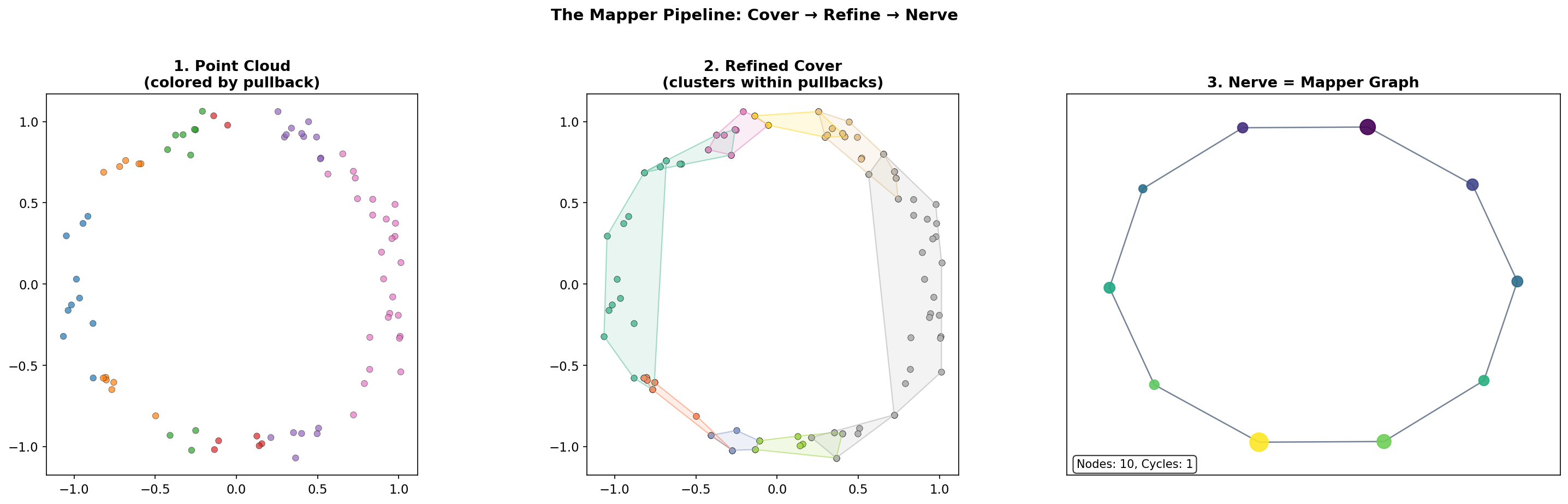
The Mapper Pipeline
The Mapper algorithm transforms a point cloud into a graph through a sequence of composable operations. We formalize each step.
Step 1: The Filter Function
Definition 1 (Filter Function (Lens)).
A filter function (or lens) is a continuous map where typically (scalar filter) or (bivariate filter). It assigns to each data point a low-dimensional “measurement” that captures some geometric or statistical property.
Common choices include eccentricity , density estimation via KDE, PCA projection , or domain-specific quantities like rolling volatility or gene expression level. The choice of filter is the primary modeling decision in Mapper — it determines which topological features are visible in the output.
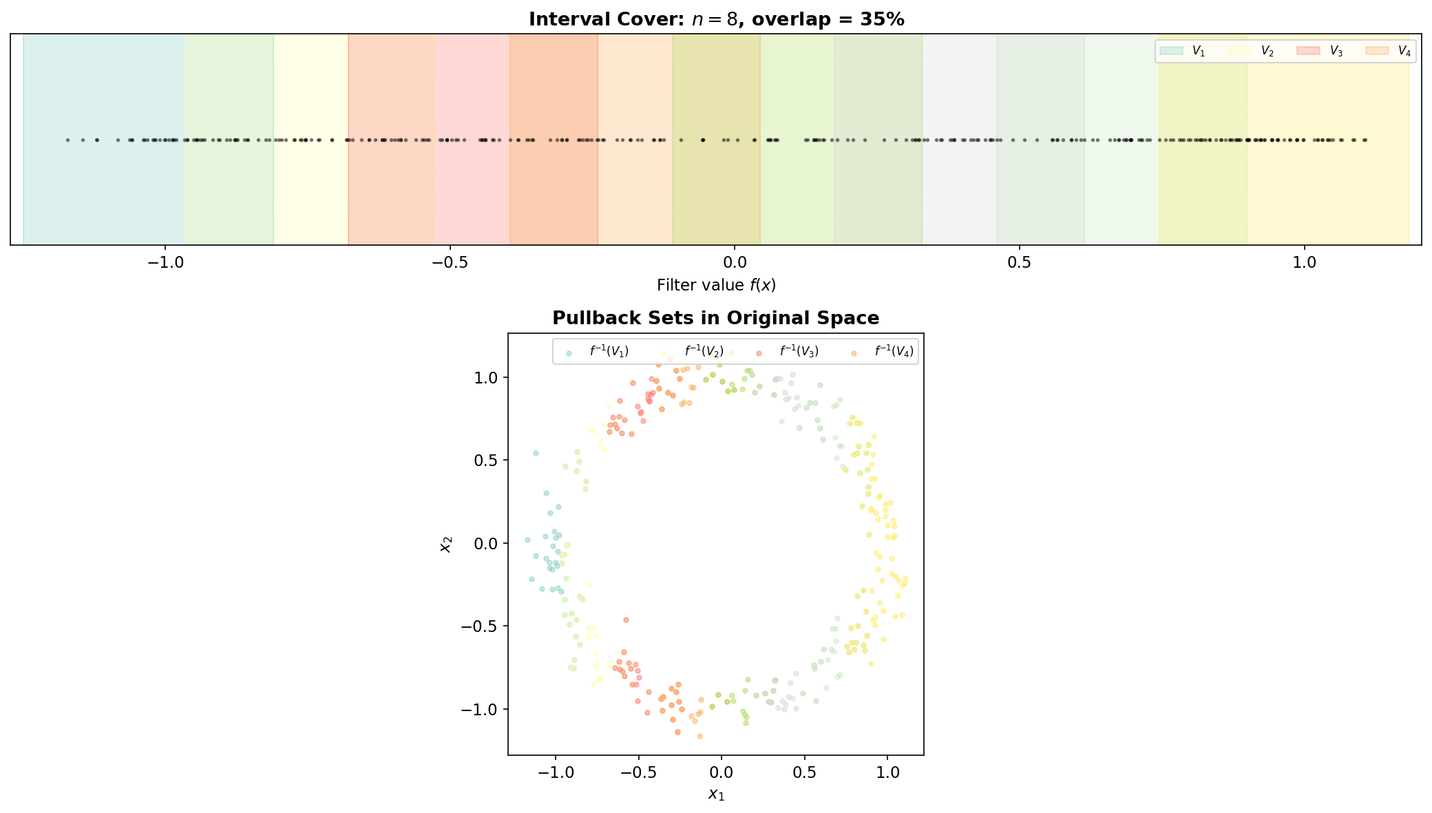
Step 2: The Cover
Definition 2 (Interval Cover).
Given the range , an interval cover is a collection of overlapping intervals that covers . The cover is parameterized by the number of intervals and the overlap fraction .
Concretely, if , the step size is , the interval width is , and each interval is . Adjacent intervals overlap by in length.
Step 3: The Pullback
Definition 3 (Pullback Cover).
The pullback cover pulls each interval back through the filter function. Each set contains all data points whose filter values lie in .
The overlap in the cover is essential: it ensures that nearby data points (in filter space) appear together in at least one pullback set, creating the shared memberships that produce edges in the final graph.
Step 4: Clustering
Definition 4 (Refined Cover).
The refined cover is obtained by applying a clustering algorithm (e.g., DBSCAN, single-linkage) independently to each pullback set : The refined cover is , the union of all clusters across all pullback sets.
This refinement step is what gives Mapper its power over a naive partitioning scheme. Within each pullback set, the clustering algorithm can detect that points which are close in filter space may be far apart in the ambient metric — they belong to different branches or components of the data. Without clustering, these geometrically separate groups would be merged into a single node.
Step 5: The Nerve (Mapper Graph)
Definition 5 (Mapper Graph).
The Mapper graph is the 1-skeleton of the nerve of the refined cover :
- Nodes: one node for each cluster
- Edges: an edge between and whenever (they share at least one data point)
The Mapper graph is a simplicial complex of dimension 1 (a graph). Two clusters share data points precisely when they come from overlapping intervals and the shared points are assigned to both clusters. This is the mechanism by which topological features of the data — loops, branches, flares — are captured in the graph.
The Complete Pipeline
In summary, the five steps of the Mapper algorithm are:
- Choose a filter function (or )
- Cover the range with overlapping intervals
- Pull back the cover: for each interval
- Cluster within each pullback set:
- Take the nerve: connect clusters that share data points
- Filter function f: X → ℝ
- Interval cover {V₁, …, Vₙ}
- Pullback f⁻¹(Vᵢ) for each i
- Cluster within each pullback
- Nerve (Mapper graph)
Interactive Pipeline Explorer
The interactive visualization below lets you step through the Mapper pipeline on a sample point cloud. Adjust the filter function, number of intervals, and overlap fraction to see how each parameter affects the resulting Mapper graph.
Color each point by its filter value (x-coordinate).
Filter Functions
The filter function is the “lens” through which Mapper views the data. Different filters reveal different aspects of the data’s shape, and there is no single “correct” choice — the filter is a modeling decision that should be guided by domain knowledge and the question being asked.
Three Canonical Filter Choices
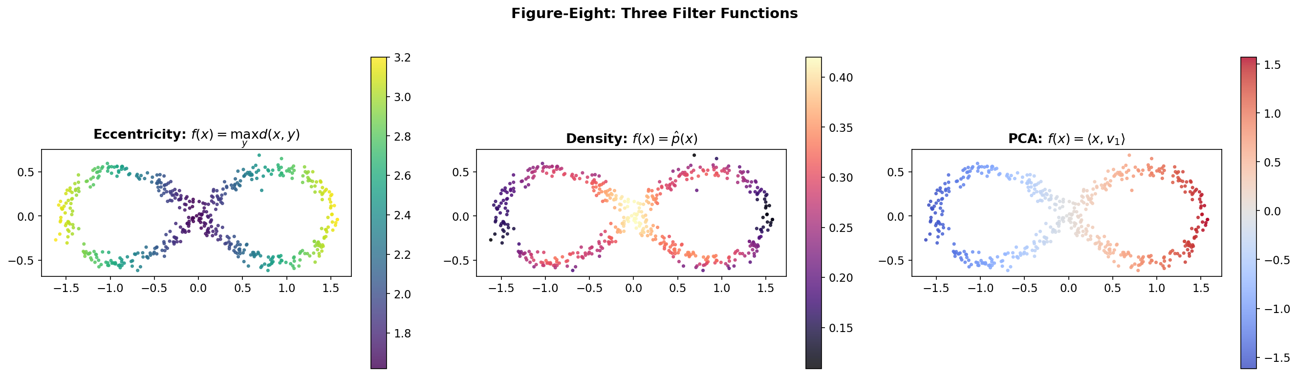
Consider a figure-eight point cloud in . Three natural filters highlight different structures:
Eccentricity measures how far each point is from the farthest point in the dataset: This filter discriminates the tips of the two lobes from the center. A Mapper graph with this filter will highlight the branching structure at the crossing point.
Density via kernel density estimation assigns to each point the local density of the data: This filter peaks at the crossing point where data is dense. It emphasizes the pinch point — topologically the most interesting feature of a figure-eight.
PCA projection projects onto the first principal component: This separates the two lobes along the axis of maximum variance. The resulting Mapper graph will clearly show the two loops as separate cycles connected at the crossing.
Choosing a filter is choosing a perspective. Each filter reveals different topological features, and an exploratory analysis will often try several filters to build a complete picture.
# Compute three filters on the figure-eight
from scipy.spatial.distance import pdist, squareform
from scipy.stats import gaussian_kde
from sklearn.decomposition import PCA

D = squareform(pdist(fig8))

# 1. Eccentricity (max distance)
ecc = D.max(axis=1)

# 2. Density via KDE
kde = gaussian_kde(fig8.T)
density = kde(fig8.T)

# 3. PCA first component
pca = PCA(n_components=1)
pca_proj = pca.fit_transform(fig8).ravel()Projects onto the horizontal axis. Vertical slices split each loop, recovering H₁ = 2.
Covering & Pullback
The interval cover and its pullback are where the Mapper algorithm converts the continuous problem (topology of a point cloud) into a combinatorial one (a cover whose nerve we can compute). The two parameters — the number of intervals and the overlap fraction — control the resolution and connectivity of the resulting graph.
Interval Cover Parameterization
Given , the step size is and the interval width is . Adjacent intervals overlap by in length. The overlap is what creates shared memberships between clusters in adjacent pullback sets, which in turn become edges in the Mapper graph.
Proposition 1 (Overlap and Connectivity).
If two data points satisfy where is the interval width and is the overlap fraction, then and appear in at least one common pullback set .
Proof.
Let be the interval width and the overlap fraction, so adjacent intervals overlap by . If , then any interval containing at distance less than from its boundary must also contain . Since the cover has overlap between consecutive intervals, at least one such interval exists. ∎
∎This proposition makes precise the intuition that overlap controls connectivity: larger overlap means more points appear in multiple pullback sets, creating more edges in the Mapper graph. The extreme case makes every pair of points co-occur in some pullback set, producing a complete graph (no useful structure). The case eliminates all overlap, making the pullback sets disjoint and producing a graph with no edges (no connectivity information).
The Pullback in Action
Each pullback set is a “slice” of the data — all points whose filter values fall in the interval . Because intervals overlap, a single data point may belong to multiple pullback sets. When that point is assigned to clusters in different pullback sets, those clusters will share the point, producing an edge in the Mapper graph.
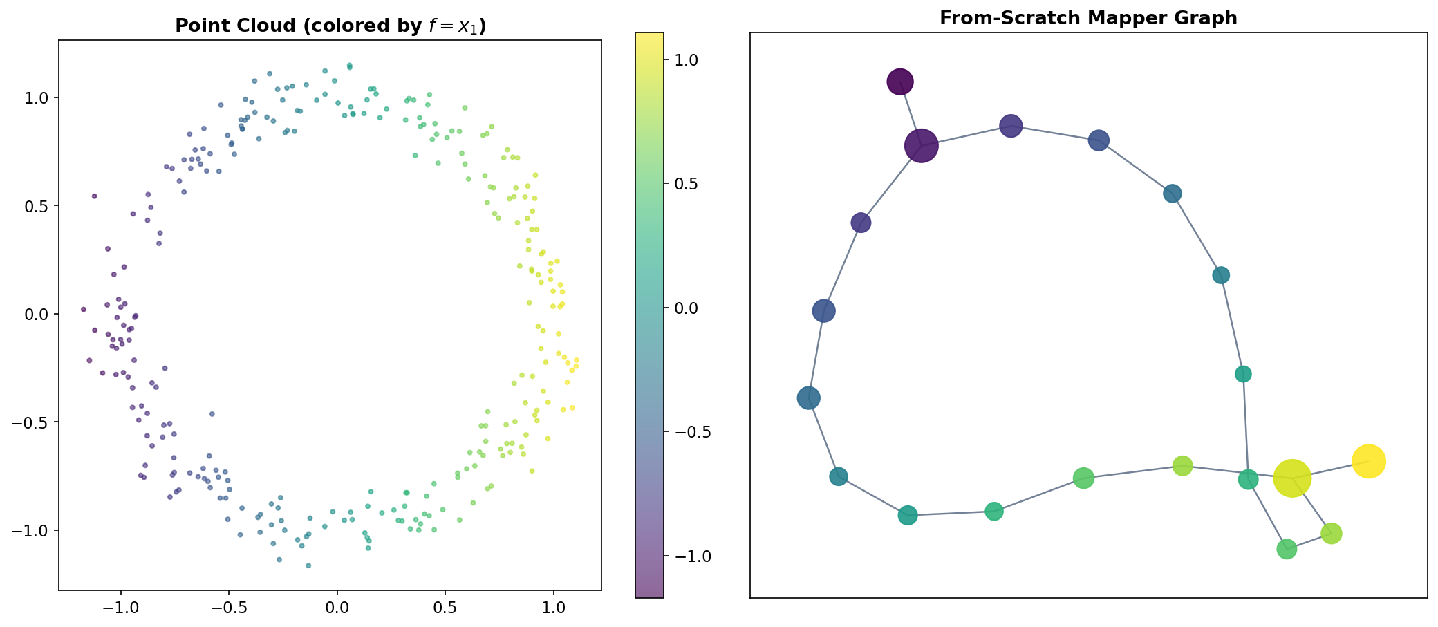
This is the geometric mechanism by which Mapper detects loops: if the data forms a circle and the filter is the x-coordinate projection, the circle is sliced into overlapping strips. At the top and bottom of the circle, each strip contains two separate groups (the upper and lower arcs), producing two clusters per interval. The shared points between adjacent intervals create edges that trace out a cycle in the Mapper graph — faithfully recovering the loop in the data.
From-Scratch Implementation
To solidify the construction, we build Mapper from scratch in pure Python. The implementation follows the five definitions above step by step.
def mapper_from_scratch(X, filter_values, n_intervals=10, overlap=0.3,
                        clusterer=None, min_cluster_size=3):
    '''
    Mapper algorithm -- from-scratch implementation.

    Parameters
    ----------
    X : ndarray, shape (n, d)
        Point cloud in ambient space.
    filter_values : ndarray, shape (n,)
        Scalar filter function evaluated at each point.
    n_intervals : int
        Number of covering intervals (Definition 2).
    overlap : float
        Fractional overlap between adjacent intervals, in (0, 1).
    clusterer : sklearn estimator or None
        Clustering algorithm with .fit_predict(). Default: DBSCAN.
    min_cluster_size : int
        Minimum points to form a cluster (used if clusterer is None).

    Returns
    -------
    graph : dict
        'nodes': {node_id: [list of point indices]}
        'edges': [(node_id_a, node_id_b)]
        'meta':  {node_id: {'interval': i, 'cluster': j, 'size': k}}
    '''
    if clusterer is None:
        # Adaptive DBSCAN: eps = 10th percentile of pairwise distances
        from scipy.spatial.distance import pdist
        dists = pdist(X)
        eps = np.percentile(dists, 10)
        clusterer = DBSCAN(eps=eps, min_samples=min_cluster_size)

    f = filter_values
    f_min, f_max = f.min(), f.max()

    # --- Step 2: Build interval cover (Definition 2) ---
    step = (f_max - f_min) / n_intervals
    width = step / (1 - overlap)
    intervals = []
    for i in range(n_intervals):
        left = f_min + i * step - (width - step) / 2
        right = left + width
        intervals.append((left, right))

    # --- Steps 3 & 4: Pullback and cluster (Definitions 3 & 4) ---
    nodes = {}
    meta = {}
    node_id = 0

    for i, (left, right) in enumerate(intervals):
        # Pullback: points whose filter value falls in [left, right]
        mask = (f >= left) & (f <= right)
        indices = np.where(mask)[0]

        if len(indices) < min_cluster_size:
            continue

        # Cluster within the pullback set
        labels = clusterer.fit_predict(X[indices])

        for label in set(labels):
            if label == -1:  # noise in DBSCAN
                continue
            cluster_members = indices[labels == label]
            nodes[node_id] = list(cluster_members)
            meta[node_id] = {'interval': i, 'cluster': label,
                             'size': len(cluster_members)}
            node_id += 1

    # --- Step 5: Build the nerve (Definition 5) ---
    edges = []
    node_ids = list(nodes.keys())
    for a in range(len(node_ids)):
        for b in range(a + 1, len(node_ids)):
            id_a, id_b = node_ids[a], node_ids[b]
            # Edge iff clusters share at least one data point
            if set(nodes[id_a]) & set(nodes[id_b]):
                edges.append((id_a, id_b))

    return {'nodes': nodes, 'edges': edges, 'meta': meta}
The implementation is deliberately simple — about 50 lines of code — to emphasize that Mapper is a composition of elementary operations. The mathematical content is in the definitions; the code is a direct translation. In production, libraries like KeplerMapper add optimizations (spatial indexing for the nerve computation, efficient cluster tracking, HTML visualization), but the core logic is identical.
Classic Examples
The Circle
The simplest non-trivial test case is a noisy circle in . A circle has Betti numbers (one connected component) and (one loop). Using the x-coordinate projection as a filter, the Mapper algorithm slices the circle into overlapping vertical strips. Each strip intersects the circle in one or two arcs, which become clusters. The shared points between adjacent clusters create a cycle in the Mapper graph — faithfully recovering the feature.
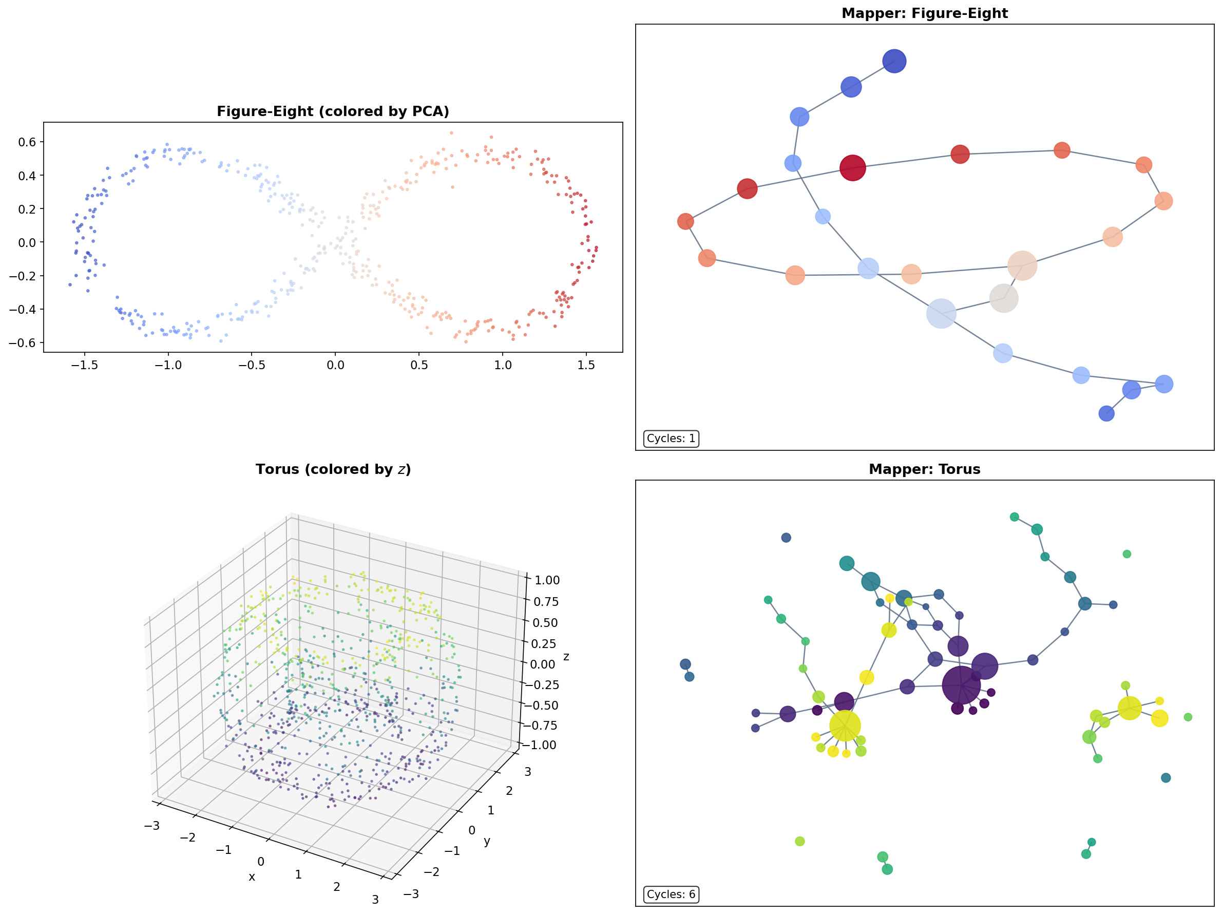
The Figure-Eight
A figure-eight (wedge of two circles) has and . Mapper with an eccentricity filter recovers the two loops and the branching point where they meet. The Mapper graph is a “figure-eight graph” — two cycles sharing a single node at the crossing point.
The Torus
A torus embedded in has , (two independent loops — meridional and longitudinal), and (a cavity). While the 1-skeleton Mapper graph cannot directly detect the feature, it reveals the two independent cycles and the overall connectivity structure of the torus.
KeplerMapper
For production work, the KeplerMapper library (van Veen et al., 2019) provides an optimized, well-tested implementation with built-in HTML visualization. The workflow condenses to three lines:
import kmapper as km
from sklearn.cluster import DBSCAN

mapper = km.KeplerMapper(verbose=0)
lens = mapper.fit_transform(X, projection=[0])      # Step 1: filter
graph = mapper.map(lens, X,                          # Steps 2-5
                   cover=km.Cover(n_cubes=10, perc_overlap=0.3),
                   clusterer=DBSCAN(eps=0.5))
The fit_transform method computes the filter function (here, projection onto the first coordinate). The map method handles covering, pullback, clustering, and nerve computation in a single call. The Cover object parameterizes the interval cover: n_cubes is the number of intervals (generalizing to hypercubes for multivariate filters) and perc_overlap is the overlap fraction .
KeplerMapper also supports bivariate filters (projecting to and covering with a 2D grid of overlapping rectangles), custom clustering algorithms, and interactive HTML visualization via mapper.visualize(). The HTML output is a force-directed graph layout where node size encodes cluster size and node color encodes a user-specified function — useful for exploratory data analysis.
# Full KeplerMapper workflow with visualization
mapper_km = km.KeplerMapper(verbose=0)

# Circle example
lens_circle = mapper_km.fit_transform(circle, projection=[0])
graph_km_circle = mapper_km.map(lens_circle, circle,
                                 cover=km.Cover(n_cubes=12, perc_overlap=0.4),
                                 clusterer=DBSCAN(eps=0.3, min_samples=3))

# Figure-eight with L2 norm filter
lens_fig8 = mapper_km.fit_transform(fig8, projection="l2norm")
graph_km_fig8 = mapper_km.map(lens_fig8, fig8,
                               cover=km.Cover(n_cubes=15, perc_overlap=0.45),
                               clusterer=DBSCAN(eps=0.15, min_samples=5))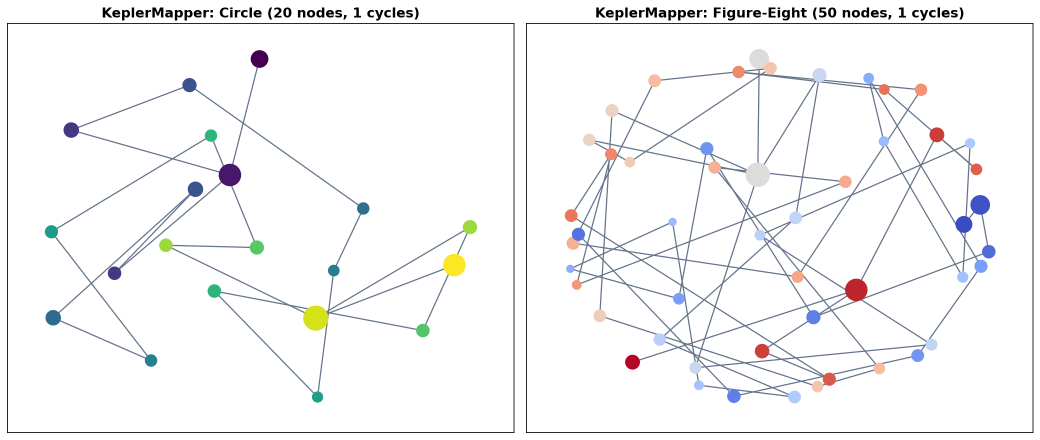
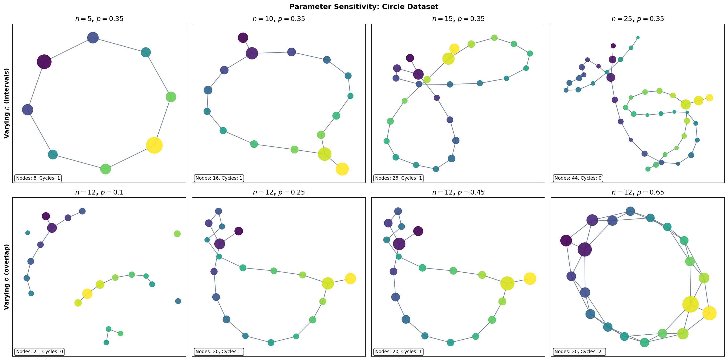
Parameter Sensitivity
The Mapper graph depends on three choices: the filter function , the number of intervals , and the overlap fraction (plus the clustering algorithm and its parameters). Understanding how the graph responds to parameter changes is essential for drawing reliable conclusions.
The Number of Intervals
The number of intervals controls the resolution of the Mapper graph:
- Too few intervals ( small): each pullback set contains many points, and the clustering step may merge geometrically distinct groups. The graph is over-smoothed — topological features are lost.
- Too many intervals ( large): each pullback set contains few points, and the clustering step may fragment coherent groups. The graph is noisy — spurious features appear.
- The Goldilocks zone: there exists a range of values where the graph is stable — the same topological features (connected components, loops) persist across the range. This is the regime where Mapper is most informative.
The Overlap Fraction
The overlap fraction controls the connectivity of the Mapper graph:
- Low overlap ( near 0): pullback sets are nearly disjoint, so few clusters share data points. The graph has many isolated nodes and few edges — connectivity information is lost.
- High overlap ( near 1): pullback sets overlap heavily, so many clusters share data points. The graph is densely connected — topological structure is drowned in edges.
- Moderate overlap (): the typical sweet spot. Enough overlap to detect genuine connections, but not so much that the graph becomes uninformative.
Stability Heuristic
A practical heuristic for parameter selection: compute Mapper graphs over a grid of values and look for the stable range — parameter combinations where topological invariants (the number of connected components and the first Betti number ) remain constant. Features that persist across a wide range of parameters are likely genuine; features that appear only at specific parameter values are likely artifacts.
Varying n_intervals (overlap = 0.35)
Varying overlap (n_intervals = 12)
The Nerve Theorem Connection
The Nerve Theorem is the mathematical engine that powers Mapper. It provides the theoretical guarantee that the Mapper graph faithfully captures the topology of the data — not just approximately, but exactly, under appropriate conditions.
Theorem 1 (Mapper--Nerve Correspondence).
If the refined cover is a good cover (every non-empty finite intersection is contractible), then the Mapper graph is homotopy equivalent to the union : In particular, the connected components () and loops () of the Mapper graph faithfully reflect those of the data.
The key question is: when is the refined cover a good cover? Recall from the Cech Complexes & Nerve Theorem page (Definition 5) that a good cover requires every non-empty finite intersection to be contractible.
In Euclidean space, convex sets form good covers automatically (intersections of convex sets are convex, hence contractible). When the clustering algorithm produces convex clusters — for example, single-linkage clustering with a distance threshold, or -means on well-separated data — the refined cover is a good cover and the Nerve Theorem applies directly.
In practice, DBSCAN clusters are not guaranteed to be convex. However, they are typically connected and “approximately convex” in the sense that their intersections (which arise from the overlap region of adjacent intervals) are small, connected subsets. Empirical evidence strongly supports the Nerve Theorem correspondence even when the strict good cover condition is not met — topological features detected by Mapper overwhelmingly correspond to genuine features of the data.
The Persistent Nerve Theorem
For a more robust theoretical foundation, the Persistent Nerve Theorem extends the classical Nerve Theorem to filtrations:
Theorem 2 (Persistent Nerve Theorem (Chazal & Oudot, 2008)).
For a family of covers indexed by a scale parameter, the persistence modules of the nerves are interleaved with the persistence modules of the unions . This guarantees that topological features persistent across scales in the Mapper construction correspond to genuine features of the underlying space.
This result is the theoretical justification for the stability heuristic described in the previous section. When a topological feature of the Mapper graph persists across a range of parameter values (varying the cover resolution ), the Persistent Nerve Theorem guarantees that this feature corresponds to a genuine topological feature of the data that persists across the corresponding scales in the cover.
For the full proof of the Nerve Theorem, see our Cech Complexes & Nerve Theorem page, Theorem 2. The proof via partition-of-unity maps given there applies directly to the Mapper setting: the refined cover plays the role of the cover , and the nerve plays the role of the Cech complex.
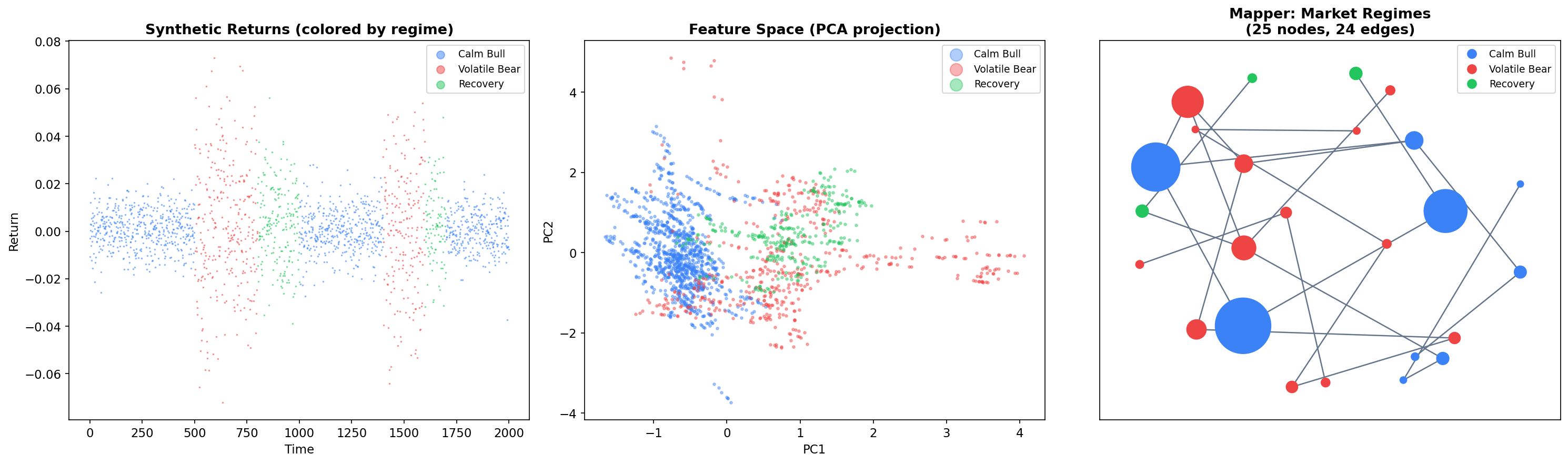
Financial Market Regime Detection
One of Mapper’s most compelling applications is unsupervised market regime detection. Financial markets exhibit distinct regimes — bull markets, bear markets, and transition periods — that correspond to different statistical properties of returns. Mapper can discover these regimes and their transitions without any labeled data, producing a topological map of market states.
Feature Engineering
We generate synthetic market data with three regimes (calm bull, volatile bear, and recovery) and compute rolling features over a 60-day window:
import numpy as np
from sklearn.preprocessing import StandardScaler

def generate_regime_returns(n_periods=2000):
    '''Generate synthetic returns with three market regimes.'''
    returns = np.zeros(n_periods)
    regime = np.zeros(n_periods, dtype=int)

    # Regime 0: Calm bull market (low vol, positive drift)
    # Regime 1: Volatile bear market (high vol, negative drift)
    # Regime 2: Recovery / transition (medium vol, high positive drift)

    params = {
        0: {'mu': 0.0005, 'sigma': 0.008},   # Calm bull
        1: {'mu': -0.001, 'sigma': 0.025},     # Volatile bear
        2: {'mu': 0.002, 'sigma': 0.015}       # Recovery
    }

    regime_sequence = [0]*500 + [1]*300 + [2]*200 + [0]*400 + [1]*200 + [2]*100 + [0]*300
    regime_sequence = regime_sequence[:n_periods]

    for t in range(n_periods):
        r = regime_sequence[t]
        regime[t] = r
        returns[t] = np.random.normal(params[r]['mu'], params[r]['sigma'])

    return returns, regime

returns, true_regime = generate_regime_returns(2000)

# Compute rolling features
window = 60
rolling_mean = np.array([np.mean(returns[max(0,i-window):i])
                         for i in range(window, len(returns))])
rolling_vol = np.array([np.std(returns[max(0,i-window):i])
                        for i in range(window, len(returns))])
rolling_skew = np.array([
    np.mean(((returns[max(0,i-window):i] - np.mean(returns[max(0,i-window):i])) /
              max(np.std(returns[max(0,i-window):i]), 1e-8))**3)
    for i in range(window, len(returns))
])

# Feature matrix
X_fin = np.column_stack([rolling_mean, rolling_vol, rolling_skew])
X_fin_scaled = StandardScaler().fit_transform(X_fin)
Mapper on Financial Data
We apply Mapper with an L2-norm filter (eccentricity-like), which captures how “extreme” each market state is relative to normal conditions:
mapper_fin = km.KeplerMapper(verbose=0)
lens_fin = mapper_fin.fit_transform(X_fin_scaled, projection="l2norm")

graph_fin = mapper_fin.map(lens_fin, X_fin_scaled,
                            cover=km.Cover(n_cubes=15, perc_overlap=0.4),
                            clusterer=DBSCAN(eps=0.8, min_samples=10))
Reading the Mapper Graph
The resulting graph reveals three key structures:
-
Regime clusters: Nodes dominated by a single regime (blue = calm bull, red = volatile bear, green = recovery) form tight groups. These correspond to stable market states.
-
Transition edges: Edges connecting nodes of different colors represent regime transitions — periods where market conditions are evolving from one state to another. These are precisely the points that fall in the overlap region of adjacent covering intervals.
-
Graph topology: The overall graph structure reveals how regimes connect. If the graph has a loop, it suggests a cyclical pattern (e.g., bull to bear to recovery to bull). Branching suggests multiple possible transitions from a single state.
This is Mapper’s unique contribution to market analysis: it provides a topological map of market states and transitions that standard clustering methods cannot produce. The graph is interpretable, colorable by any feature of interest, and directly reveals the transition dynamics.
Statistical Convergence
Theorem 3 (Statistical Convergence (Carriere & Oudot, 2018)).
Under mild regularity conditions, as the number of data points with appropriately scaled parameters, the Mapper graph converges in the bottleneck distance to the Reeb graph of the filter function applied to the underlying probability distribution’s support.
More precisely, if is an i.i.d. sample from a distribution on with density , and if the filter function is Lipschitz, then for appropriate choices of cover parameters (growing with ), the Reeb graph of is recovered in the limit. This provides rigorous justification for using Mapper on finite samples: with enough data, the Mapper graph faithfully approximates the continuous topological summary.
Stability & Further Reading
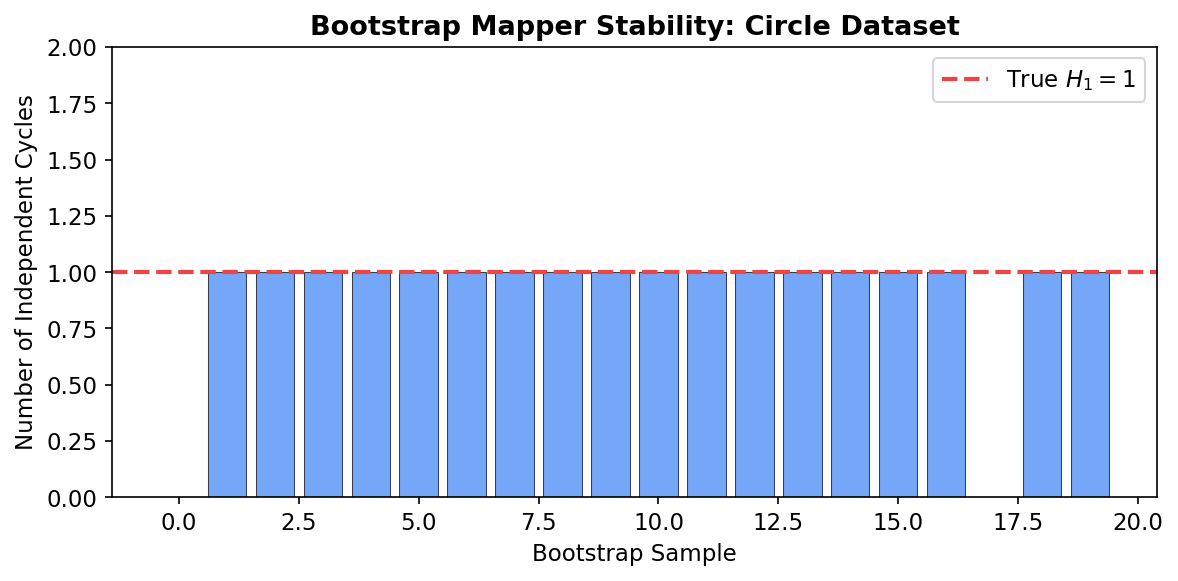
Bootstrap Mapper
A natural concern with Mapper is its sensitivity to parameter choices. The bootstrap Mapper procedure provides a practical stability assessment: resample the data (with replacement) times, compute Mapper on each bootstrap sample, and retain only graph features (connected components, cycles) that appear in a majority of bootstrap samples. This is analogous to the stability selection principle in statistics.
import networkx as nx

# Bootstrap stability demonstration
np.random.seed(42)
n_bootstrap = 20

# Track cycle counts across bootstrap samples
cycle_counts = []

for b in range(n_bootstrap):
    # Bootstrap resample
    idx = np.random.choice(len(circle), size=len(circle), replace=True)
    X_boot = circle[idx]
    f_boot = X_boot[:, 0]

    # Run Mapper
    result = mapper_from_scratch(X_boot, f_boot,
                                  n_intervals=10, overlap=0.35)

    # Count independent cycles (beta_1 = edges - nodes + components)
    G_boot = nx.Graph()
    G_boot.add_nodes_from(result['nodes'].keys())
    G_boot.add_edges_from(result['edges'])
    beta_1 = len(result['edges']) - len(result['nodes']) + \
             nx.number_connected_components(G_boot)
    cycle_counts.append(beta_1)

print(f"Cycle counts across {n_bootstrap} bootstrap samples: {cycle_counts}")
print(f"Median: {np.median(cycle_counts)}, Std: {np.std(cycle_counts):.2f}")
Features that appear consistently across bootstrap samples are robust. If the circle’s loop () appears in 19 out of 20 bootstrap samples, we can be confident it reflects genuine topology rather than a parameter artifact.
Variants and Extensions
The Mapper algorithm has inspired several important variants:
| Variant | Key Idea | Reference |
|---|---|---|
| Reeb Graph | The continuous limit of Mapper as resolution | Classical (Reeb, 1946) |
| Multiscale Mapper | Uses persistent homology to select optimal cover resolution | Dey, Memoli & Wang, 2016 |
| Ball Mapper | Removes the filter function; covers the data directly with balls | Dlotko, 2019 |
| Stochastic Mapper | Randomized construction for scalability | Various, 2020s |
Reeb graphs are the continuous analogue of Mapper: given a continuous function on a topological space, the Reeb graph is the quotient space obtained by identifying points in the same connected component of each level set . Theorem 3 above states that Mapper converges to the Reeb graph in the limit of infinite data and infinitely refined covers.
Multiscale Mapper (Dey, Memoli & Wang, 2016) addresses the parameter selection problem by computing Mapper at multiple resolutions simultaneously and using persistent homology to identify features that persist across scales. This connects Mapper back to Persistent Homology in a theoretically principled way.
Ball Mapper (Dlotko, 2019) eliminates the filter function entirely. Instead of pulling back a cover of through , it directly covers the data with balls of a fixed radius and takes the nerve. This produces a simplicial complex (not just a graph) that captures higher-dimensional topological features, at the cost of losing the interpretability that comes from a filter function.
Connections to Other Topics
The Mapper algorithm sits at the intersection of several topics developed on formalML:
- Simplicial Complexes: The Mapper graph is a 1-dimensional simplicial complex (graph). Higher-dimensional nerves can be computed but are rarely needed in practice.
- Persistent Homology: PH on the Mapper graph quantifies its topological features. Multiscale Mapper uses PH to select optimal parameters.
- Cech Complexes & Nerve Theorem: The Nerve Theorem is the theoretical foundation of Mapper. The proof via partition-of-unity maps given on that page applies directly to the Mapper setting.
Connections
- the Mapper graph is a 1-dimensional simplicial complex (graph) simplicial-complexes
- PH on the Mapper graph quantifies topological features; multiscale Mapper uses PH persistent-homology
- the Nerve Theorem (proved in Čech Complexes) is the theoretical foundation of Mapper cech-complexes
- stability of Mapper under perturbation is measured via bottleneck distance barcodes-bottleneck
References & Further Reading
- paper Topological Methods for the Analysis of High Dimensional Data Sets and 3D Object Recognition — Singh, Mémoli & Carlsson (2007) The original Mapper paper
- paper Extracting insights from the shape of complex data using topology — Lum, Singh, Lehman, Ishkanov, Vejdemo-Johansson, Alagappan, Carlsson & Carlsson (2013) Landmark applications — breast cancer, NBA, politics
- paper Structure and Stability of the One-Dimensional Mapper — Carrière & Oudot (2018) Convergence and stability theory
- paper Towards persistence-based reconstruction in Euclidean spaces — Chazal & Oudot (2008) Persistent Nerve Theorem
- paper Kepler Mapper: A flexible Python implementation of the Mapper algorithm — van Veen, Saul, Eargle & Mangham (2019) KeplerMapper library
- paper Multiscale Mapper: Topological Summarization via Codomain Covers — Dey, Mémoli & Wang (2016) Multiscale Mapper construction
- paper Ball Mapper: A Shape Summary for Topological Data Analysis — Dłotko (2019) Ball Mapper variant — removes the filter function
- book Computational Topology: An Introduction — Edelsbrunner & Harer (2010) General reference for TDA constructions